10 Best Fonts for Modern Editorial Design (2025)


Sans Serif Fonts
1. Helvetica Neue
Vibe: Neutral, timeless, balanced, and professional. It exudes confidence without drawing attention to itself — the “blank canvas” of typography.
Best Used For: Editorials, branding, corporate layouts, and minimalist spreads.
Why Use It: Its neutrality makes it perfect for designs that rely on visuals — it lets photography and layout take center stage.
2. Lato
Vibe: Friendly, warm, and modern. It gives off an approachable, human tone while staying clean and refined.
Best Used For: Lifestyle or wellness publications, and web interfaces.
Why Use It: Ideal when you want to balance professionalism with approachability. Works great for body text in digital magazines or lifestyle blogs.
3. Futura
Vibe: Geometric, bold, and architectural — evokes Bauhaus minimalism and a futuristic edge.
Best Used For: Covers, headlines, pull quotes, and modern art or design magazines.
Why Use It: Perfect for statement visuals or spreads where typography should speak loudly.
4. Gotham
Vibe: Strong, confident, modern, and trustworthy. Feels contemporary yet human.
Best Used For: Headlines, posters, magazine covers, and campaign materials.
Why Use It: Combines authority with warmth — excellent for layouts where clarity and professionalism are key.
5. Proxima Nova
Vibe: Sleek, digital-friendly, and versatile — a modern workhorse.
Best Used For: Cross-platform layouts, tech or design publications, and online body text.
Why Use It: Highly legible on screens and adaptable to both print and digital, making it a safe, stylish all-rounder.
Serif Fonts
6. Times New Roman
Vibe: Neutral, practical, and disciplined. A no-nonsense classic that emphasizes legibility and order.
Best Used For: News, business publications, and academic or text-heavy layouts.
Why Use It: Designed for efficient reading — great when text clarity outweighs decorative style.
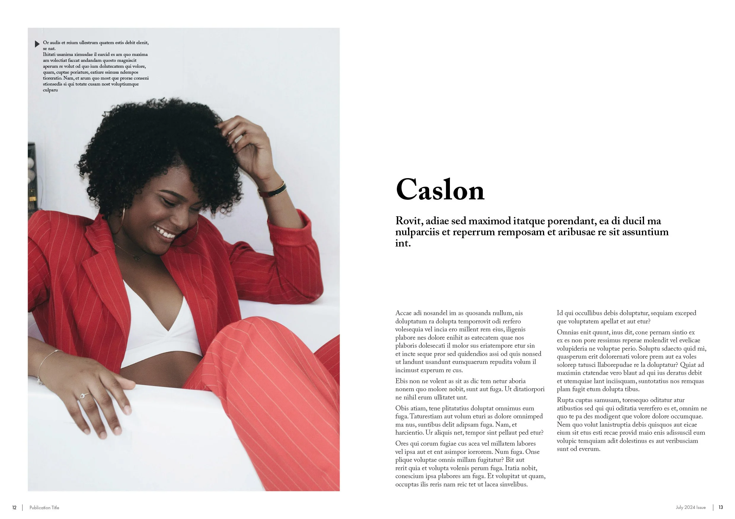
7. Caslon
Vibe: Warm, historic, and trustworthy — gives a sense of credibility and heritage.
Best Used For: Essays, heritage print, and literary publications.
Why Use It: Adds a subtle vintage tone while keeping things readable and elegant — often used in cultural or intellectual editorials.
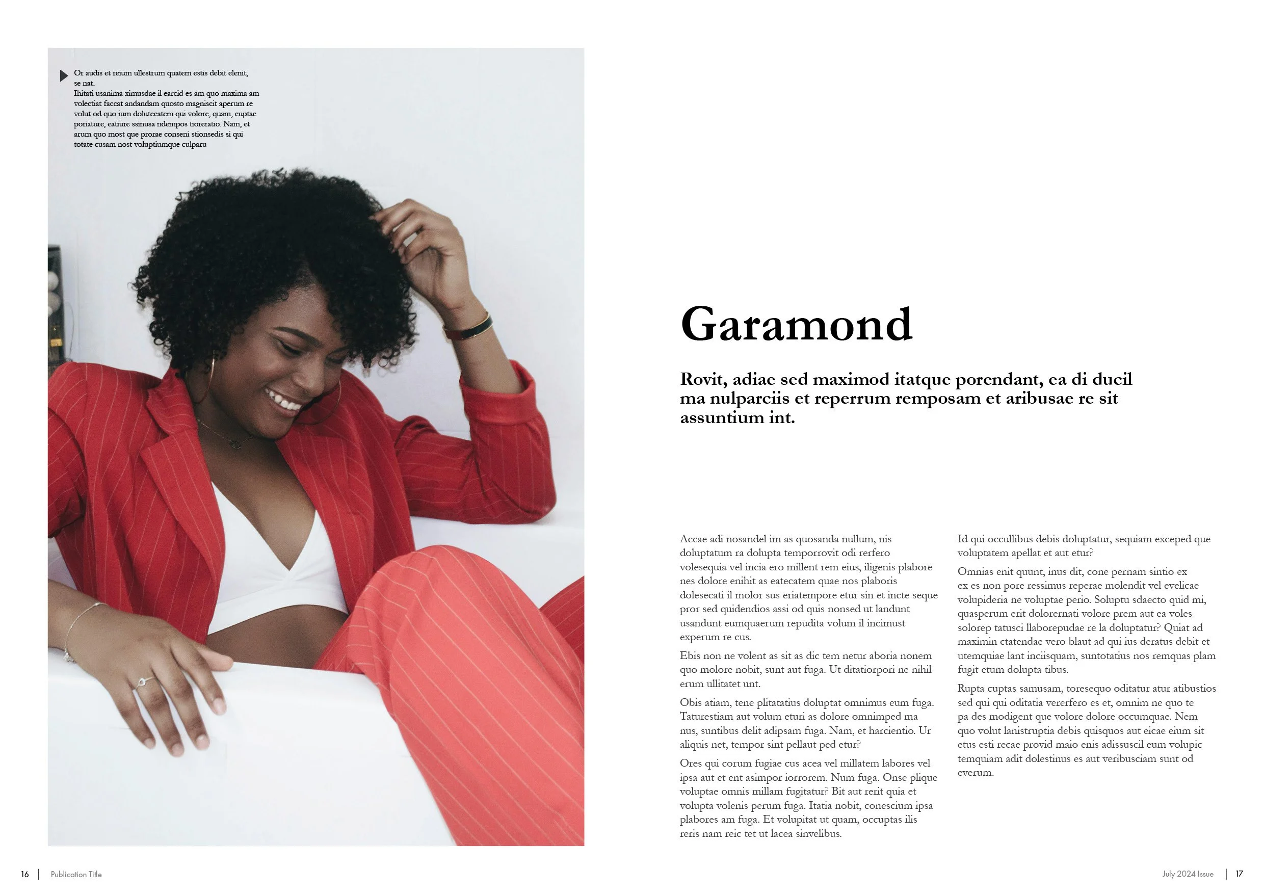
8. Garamond
Vibe: Soft, elegant, and intellectual. Conveys refinement and tradition.
Best Used For: Art magazines, book design, and educational layouts.
Why Use It: Perfect for long-form reading and projects valuing sophistication. It’s readable yet beautifully classical.
9. Georgia
Vibe: Approachable, readable, and screen-optimized — a comforting serif with warmth.
Best Used For: Digital publications, blogs, and long-form online articles.
Why Use It: Optimized for screen readability, making it excellent for digital editorials and content-heavy websites.
10. Didot
Vibe: Luxurious, glamorous, and high-contrast — pure elegance and fashion.
Best Used For: Fashion magazines, luxury branding, covers, and statement titles.
Why Use It: With its refined contrast and sophistication, Didot immediately communicates premium style and visual drama.
This is a great guide for anyone looking to find some reliable fonts to utilize - next step is to mix and match these to get your idea design, good luck!