9 InDesign Things to Turn ON to Avoid 90% of Your Frustrations

If you've been using Adobe InDesign for a while, you probably know the basics. But there are a ton of small settings and features hidden inside InDesign that can make your workflow faster, smoother, and much less frustrating.
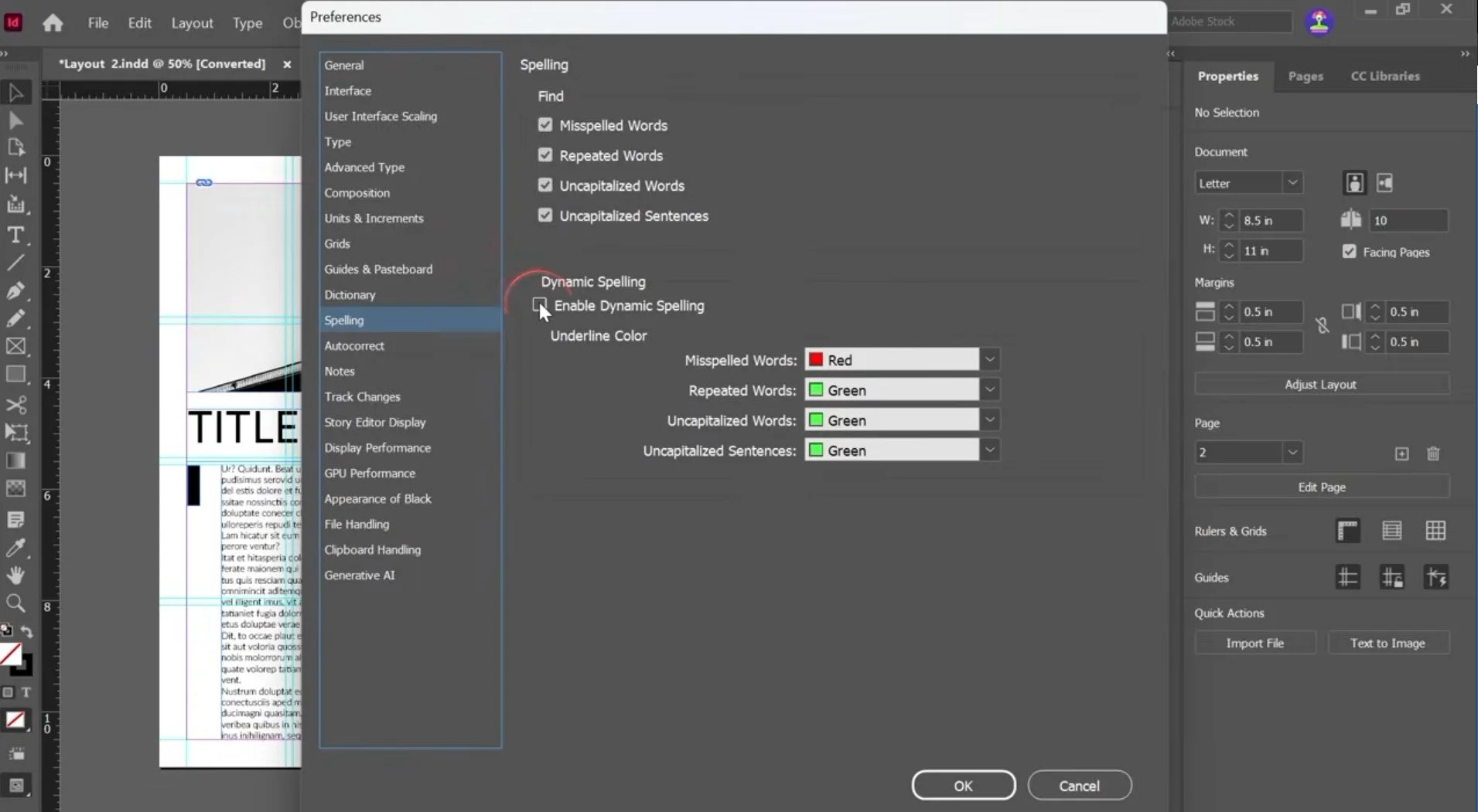
1. Turn On Dynamic Spelling
Go to:
Edit → Spelling → Dynamic Spelling
On Mac, you can also find spelling preferences under InDesign → Settings/Preferences → Spelling.
Dynamic Spelling automatically underlines potentially misspelled words as you type.
This is especially useful when you're designing because it's very easy to focus on the layout and overlook a typo.
Instead of waiting until the end of your project to run a spell check, InDesign can flag potential spelling mistakes while you're working.
Why I recommend it:
You catch mistakes while you're designing instead of during your final proofread.
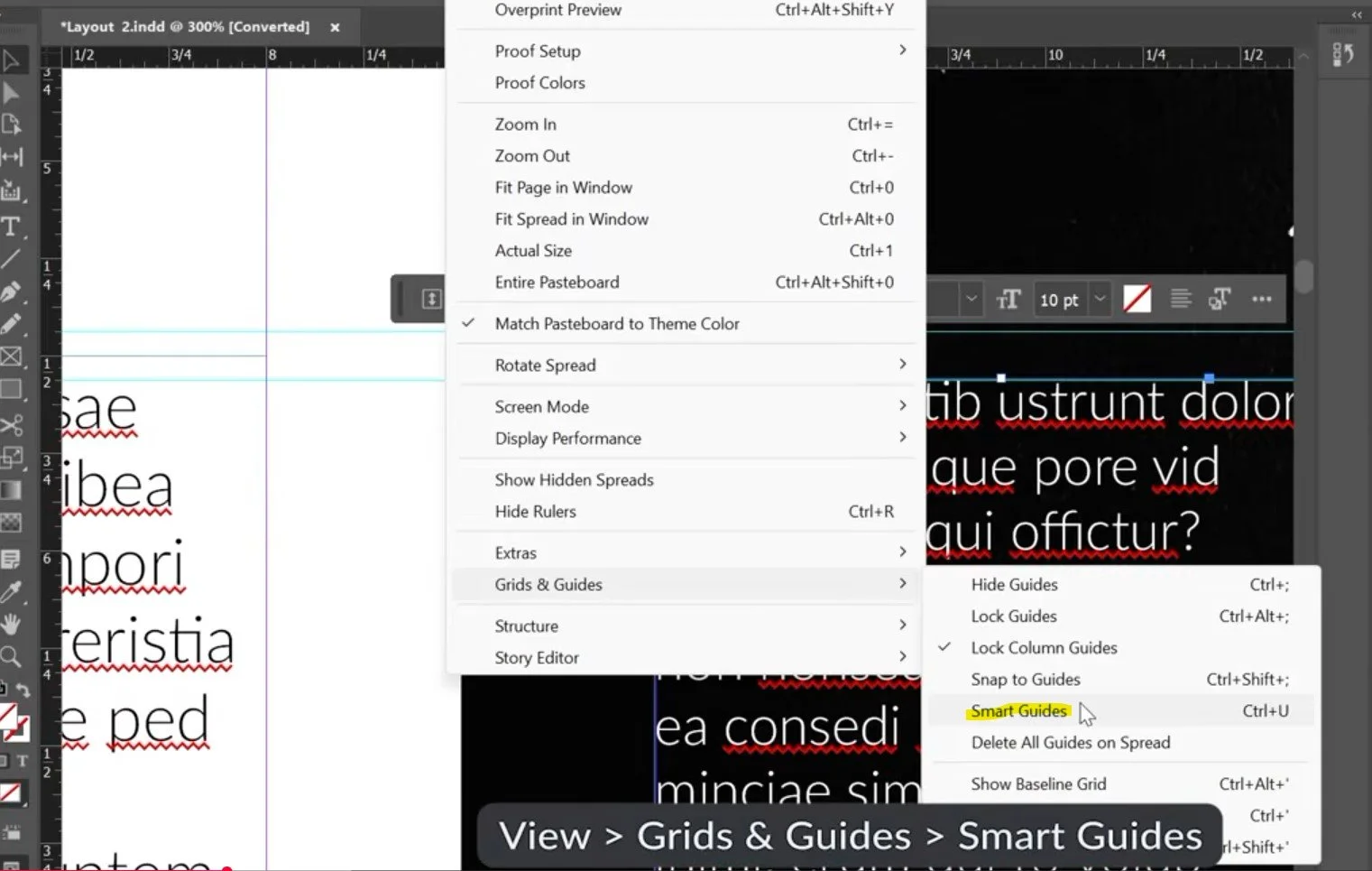
2. Turn On Smart Guides
Go to:
View → Grids & Guides → Smart Guides
Smart Guides give you temporary alignment cues when you're moving, resizing, or rotating objects. InDesign can show you when an object's edges or center line up with another object or the page.
For example, when you move an image around your layout, InDesign can automatically tell you when you've reached the center of the page or aligned an edge with another object.
This means you don't have to manually measure every single element.
Why it's useful
Smart Guides are particularly useful for:
Aligning images
Centering objects
Matching object edges
Maintaining consistent spacing
Quickly building editorial layouts
You can also customize which Smart Guide behaviors are enabled under:
Preferences → Guides & Pasteboard
Adobe provides options for Object Center, Object Edges, Smart Dimensions, and Smart Spacing.
3. Turn On Snap to Guides
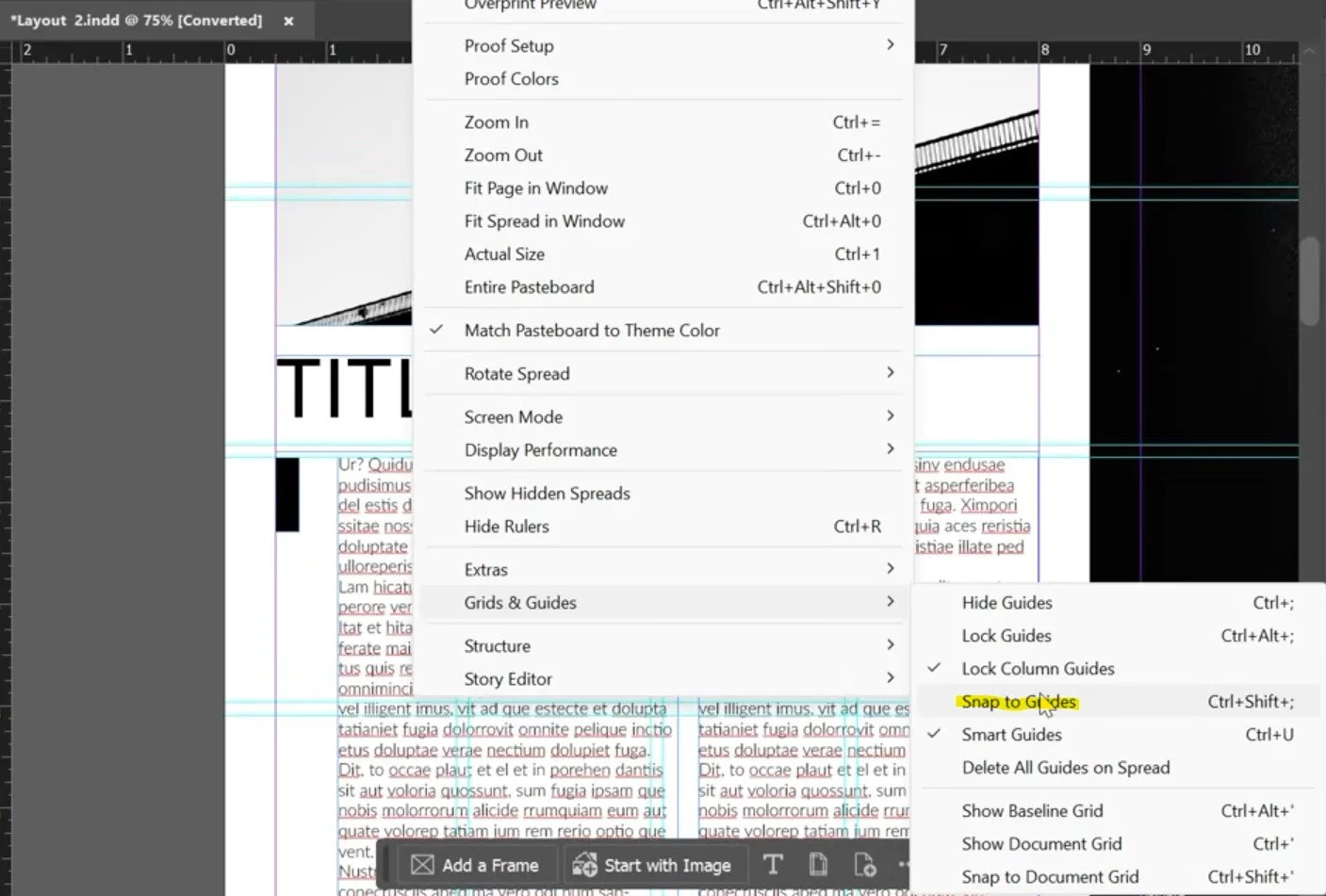
Go to:
View → Grids & Guides → Snap to Guides
Snap to Guides works slightly differently from Smart Guides.
Instead of simply showing you an alignment cue, InDesign will actually pull an object toward a guide when you get close enough.
So if you have a column guide or margin guide and drag an image toward it, you don't have to perfectly position the image yourself.
Get close...
and InDesign snaps it into place.
You can even adjust how close you need to be before snapping happens using the Snap to Zone setting in Preferences.
4. Turn On Auto-Fit
If you work with a lot of images, Auto-Fit can save you a lot of repetitive adjustments.
When you select an image frame, you can enable Auto-Fit from the Properties panel.
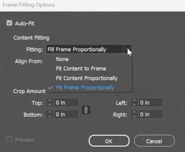
Auto-Fit controls how the content inside a frame responds when you resize the frame.
This becomes really useful when you're experimenting with different crops and image compositions.
Instead of constantly resizing your frame and then manually adjusting the image inside it, Auto-Fit helps maintain that relationship.
This is especially useful for:
Magazine layouts
Portfolios
Lookbooks
Photography books
Editorial spreads
5. Know Your Preview Modes
InDesign has several different ways to preview your document, and knowing the shortcuts can make reviewing your work much faster.
Preview Mode
Press:
W
Preview Mode hides things like guides, frame edges, and other non-printing elements so you can see your design without the editing clutter.
It's perfect for quickly switching between:
Designing → Reviewing
without manually hiding everything.
Presentation Mode
Press:
Shift + W
This puts your document into a full-screen presentation mode with the InDesign interface hidden. Adobe specifically describes this mode as useful for presenting or reviewing work without the normal interface.
Overprint Preview
Go to:
View → Overprint Preview
Overprint Preview gives you an on-screen simulation of how overprinting and color interactions will appear in output.
This becomes particularly important when you're preparing work for professional printing.
6. Turn On Hidden Characters
Go to:
Type → Show Hidden Characters
Or use:
Cmd + Option + I on Mac
Ctrl + Alt + I on Windows.
This is one of my favorite settings when something is behaving strangely.
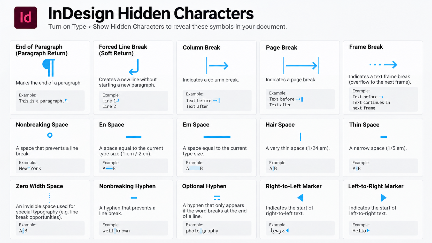
Hidden Characters reveals the invisible formatting characters inside your text, including:
Spaces
Tabs
Paragraph breaks
Soft returns
Discretionary hyphens
End-of-story markers
These characters don't print or export, but they can have a huge impact on how your text behaves.
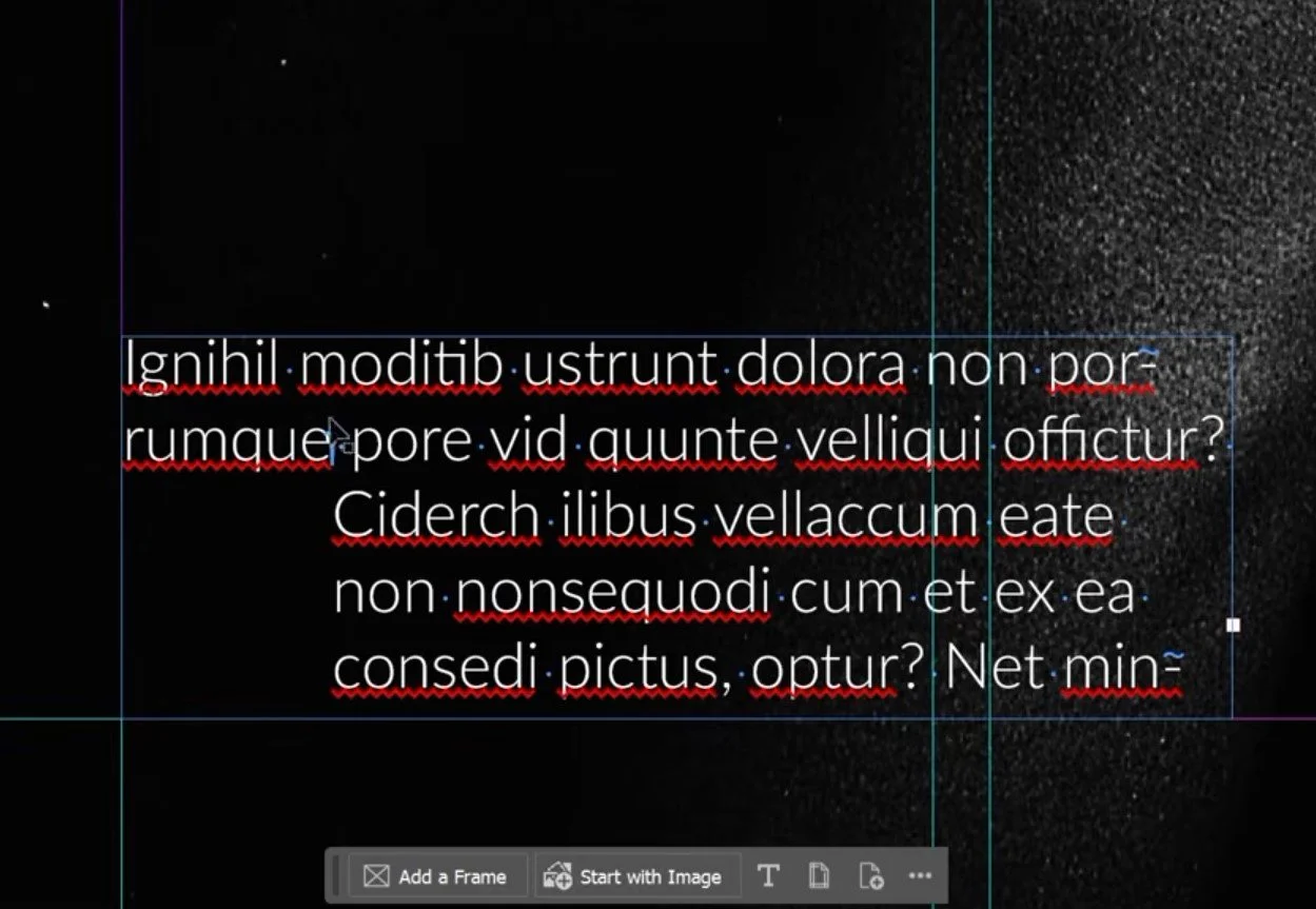
So if you're looking at a paragraph and thinking:
“Why is there a giant gap here?”
Turn this on.
You might discover that there's an extra paragraph return, tab, or forced line break causing the problem.
Pro tip
If you're troubleshooting text, I recommend keeping Hidden Characters on.
You can always press the shortcut again to hide them when you want a cleaner working view.
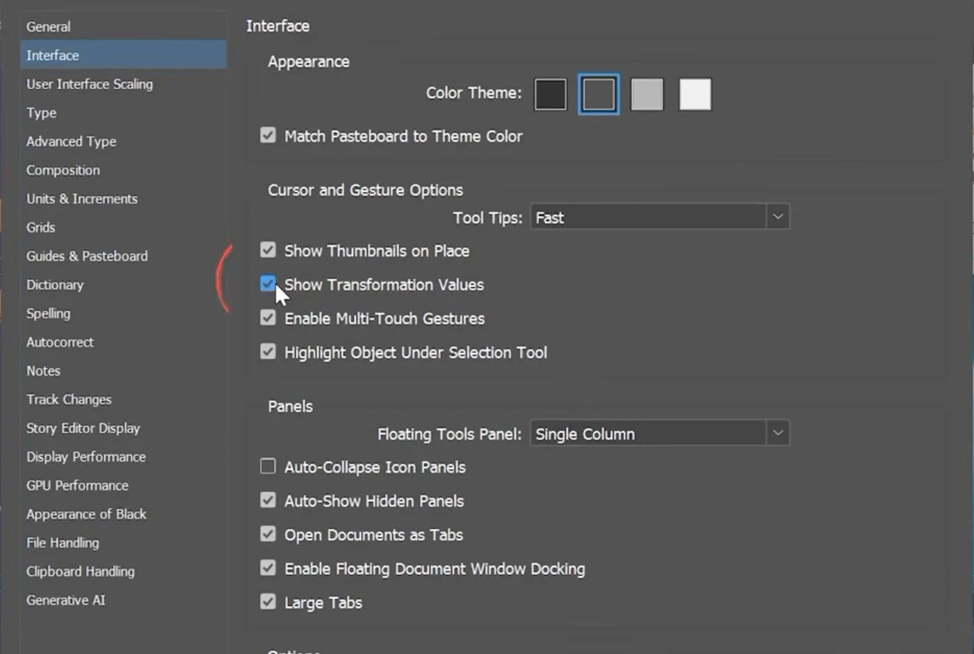
7. Turn On Show Transformation Values
Go to:
Preferences → Interface → Show Transformation Values
This is a small quality-of-life feature that can make object manipulation feel much more intuitive.
When you're moving, scaling, or transforming objects, InDesign can display useful information directly around the object rather than requiring you to constantly look back at the Control or Properties panel.
4
It's particularly useful when you're trying to make precise adjustments to images, text frames, or other objects.
Why I like it
You can keep your eyes on the layout while you're manipulating an object.
It's a tiny change, but if you're moving and resizing objects hundreds of times during a project, these little improvements add up.
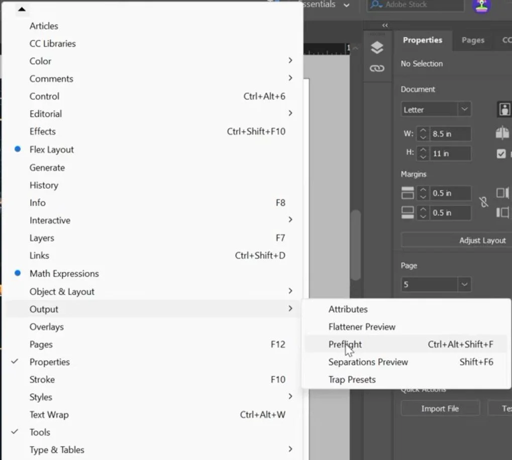
8. Check Your Colors With Separations Preview
If you're preparing something for professional printing, this is one you should know.
Go to:
Window → Output → Separations Preview
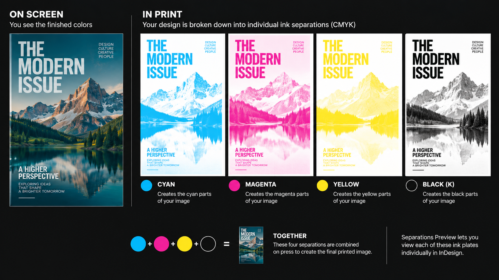
When you're looking at your design on your computer, you're seeing the finished colors.
But professional printing works differently.
Your colors may be separated into individual ink plates, such as:
Cyan
Magenta
Yellow
Black
Separations Preview lets you view those individual plates and turn them on or off to see which inks are contributing to different parts of your design. Adobe's current documentation also notes that the panel can be used to inspect spot colors, ink coverage, and overprinting.
Why is this useful?
It can help you catch things that aren't obvious when you're simply looking at the finished composite design.
For example, you might discover an unexpected spot color or an area with excessive ink coverage.
You can also use the panel to inspect how overprinting behaves across different separations.
Think of it like taking apart a finished cake and looking at all of the ingredients individually.
9. Turn On Preflight
Go to:
Window → Output → Preflight
Preflight is basically InDesign's built-in quality-control system.
4
Once enabled, Live Preflight continuously checks your document while you work and can flag problems such as:
Missing fonts
Modified links
Overset text
Low-resolution images
Color issues
Adobe's current documentation describes Preflight as continuously monitoring the document and allowing you to jump directly to affected content.
This is incredibly useful because you don't have to wait until the end of your project to discover a problem.
Instead, InDesign can tell you about it while you're still working.
Think of Preflight as your InDesign spell checker for production.
You're basically telling InDesign:
“Keep an eye on my document and tell me when something is wrong.”